Making an Impression
July 18, 2016
Photography by Brett Simpson
Anyone who’s ever held an invitation or card with tactile words pressed neatly into paper knows the enchantment of letterpress printing. Exquisite. Gorgeous. Like a kiss. "To run your fingers over the printed texture is like heaven." These are just some of the lyrical phrases devotees use to describe letterpress printing. Since the arrival of a 1963 Vandercook No. 1 letterpress last July, this centuries-old craft is now thriving in Bucknell’s Art Barn.
The press and a dazzling array of typefaces came to Bucknell through the initiative of resident printmakers Veronica Hanssens, a studio assistant in Bucknell’s Department of Art & Art History, and James Dunlap, former visiting assistant professor of digital design and print media. They connected in New York with vintage equipment broker Perry Tymeson, who had just the right press and offered to deliver it to Lewisburg and train them. Dunlap shared the potential for this intriguing display piece and classroom tool with art department chair Janice Mann, and the letterpress found a new home.
The equipment came with several sets of lead fonts, but Dunlap wanted more variety. Tymeson referred him to Ernie Blitzer, a retired New York City art director and ad man who’d done design in the 1960s and kept his typographic tools of trade. Dunlap spent 12 hours last October at Blitzer’s home, poring over retro treasures, leading to Blitzer’s generous donation of 160 fonts, cuts and dingbats, and some highly prized typography texts.
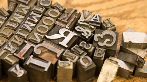
As a result, the compact space that houses the letterpress is a feast for the senses. Empty font trays adorn the walls like shadowboxes. A wooden Hamilton cabinet and cases house vintage typesetting treasures in long columns of shallow drawers, inviting closer examination. Among the stacks of raised letters in dozens of styles are old logos from Shell Oil and Coca-Cola, retro line images, decorative dingbats, Gibson Girls and Civil War imagery.
Trays of metal spacers and small lead bars are reminders that white space is crucial to readability. Colorful rubber ink, supplied by local printer Carl Weller, is hand-rolled onto frames of type assembled backwards and upside-down, giving off the faint aroma of new tires. Sample printed pieces are posted on one wall, bearing pangrams to test an entire alphabet’s impression into paper. The small press sits humbly to one side, giving no hint of its wizardry.
The room functions as a mini-museum, a tribute to an art form practiced today by a select set of professional printers and devoted hobbyists. It’s also a classroom for learning about typography. Students taking Introduction to Graphic Design compose and print letterpress projects, as do some students taking Digital Drawing and Print. Perhaps surprisingly, the digital generation finds plenty to admire in "slow art."
"One might think they would love the digital and not be so excited [about the older method], and it’s the complete opposite," Dunlap says. "They like it when chance takes over."
The artisanal method also lends context. "When you have to take individual letter forms, fit them together, then use little copper pieces for spacing and real lead for leading, you really get a more sophisticated idea of what it means to set type," Dunlap explains. "When designers go back to the computer, they have an in-depth understanding of what they’re actually doing."
Dunlap and Hanssens will selectively consider producing small runs for campus clients who may want elegant letterpress invitations or similar items. Donna Glass and Adrienne Beaver, graphic designers in the Division of Communications, say several of their clients have expressed interest, and they relish the design challenge.
"This time-consuming [process] is almost unfathomable in our print-on-demand world, where the options are endless and you can hit ‘undo’ or ‘delete’ hundreds of times," Beaver says. "But I love the feeling of holding metal type in my hand. To me it’s more elegant than a fistful of diamonds."
The love for letterpress seems fitting at a time when microbrews, local food and vinyl records are trending. For those who value care and quality over mass production, a piece of letterpress art is worth the extra effort and cost.
"It’s important to learn to slow down and appreciate the time it takes to create quality printed pieces," says Glass. "It teaches patience in an immediate-gratification world."
Hanssens agrees. "There’s something to be said for slow, labor-intensive processes. The thought of selecting all of your words, and every letter for each word, slowly and carefully … maybe some of our politicians should try it."

